Buttons
Used for key CTAs - the default colour should be used for primary CTAs and the other variants used for secondary CTAs. The 'clipped' variant should only be used for London. There is also an option to make the button stretch to the full width of it's container if required.
Contact block
A block with contact details in it. The title is required, and you can check boxes to include the default Enquiries Team contact information, or add up to three of your own contacts.
- Menu: SU Components (New) > Contact block
- Location: /site/razor/template-components/contact-block.cshtml
- Pattern library: https://staffsweb.github.io/staffs/design-system/components/detail/contact-us.html (image not currently implemented as not required)
CTA banner
An image banner with a primary CTA button. The background image can be in-focus or blurred.
- Menu: SU Components (New) > CTA banner
- Location: /site/razor/template-components/cta-banner.cshtml
- Pattern library: https://staffsweb.github.io/staffs/design-system/components/detail/banner--default.html
Undergraduate Open Day
Body text of the CTA banner component (optional)
CTA box
A box that features a title, description and a primary CTA button. It is responsive so will fill the size of the container in which it is used. It has various colour styles as shown in the pattern library.
- Menu: SU Components (New) > CTA box
- Location: /site/razor/template-components/cta-box.cshtml
- Pattern library: https://staffsweb.github.io/staffs/design-system/components/detail/box--default.html
This is the body text of the CTA box
Facilities
Component which outputs facilites from the 'Facilities' entries in the CMS. There are two tabs in the component, one to use if you want to show multiple facilities in a slider arrangement, and one to use for a single facility in a container. There is a separate version for the London site as it has different colour options.
- Menu:
- SU Components (New) > Facilities
- SU Components (New) > Facilities (London)
- Location:
- /site/razor/template-components/card-facilities.cshtml
- /site/razor/template-components/london/card-facilities.cshtml
- Pattern library: https://staffsweb.github.io/staffs/design-system/components/detail/tile--examples.html
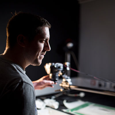
Animation Studios
Our well-equipped Animation studios house a number of resources allowing for a number of Animation methods. Read more
Including: Cintiq Suites for 2D and 3D Digital animation, 4K edit Suite, Sound Recording booth, access to Motion Capture technology and dual-screen PC digital suite with access to software including MAYA and TOON BOOM.
Join Course Leader Stuart Messinger for a tour around our Animation Studios.
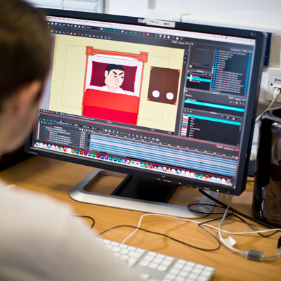
CGI Workshop
The centre of post production in the animation department, boasting a number of Apple edit suites and industry standard animation software.
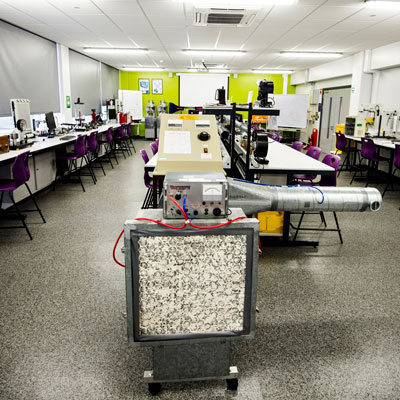
Engineering Laboratories
Packed with state-of-the-art software and hardware resources reflecting current trends in the development of engineering subjects.
Feature link
A feature link which can have an optional image. Used to signpost content on landing pages.
Feature tiles
A set of image tiles to signpost various areas of the site. Has an option to show as an 'off-grid' layout or a more standard grid ordered layout. There is a minimum of 6 items which can be added to this component. The images need to be 500px square. There is a separate version for the London site as it has different colour options.
- Menu:
- SU Components (New) > Feature tiles
- SU Components (New) > Feature tiles (London)
- Location:
- /site/razor/template-components/feature-tiles.cshtml
- /site/razor/template-components/london/feature-tiles.cshtml
- Pattern library:
- https://staffsweb.github.io/staffs/design-system/components/detail/feature-tiles--default.html
- https://staffsweb.github.io/staffs/design-system/components/detail/feature-tiles--ldn.html
Horizontal rule
A horizontal rule which can be used to divide content on the page. There are various style options, including the default (grey) and primary (red for staffs, blue for London). There is a spacing version too which can be used to include a little more vertical spacing, but please use this one in moderation and use the sections for spacing for grouped elements. All of the triangle variants should only be used on the London microsite as it is part of their brand.
- Menu: SU Components (New) > Horizontal rule
- Location: /site/razor/template-components/horizontal-rule.cshtml
- Pattern library: https://staffsweb.github.io/staffs/design-system/components/detail/hr--default.html (and variants)
Icon box
A piece of content with an icon next to it, can be used for key selling points or similar. Icons should ideally be SVG format. SVGs should be saved in /image-library/icons (/microsites/london/images/icons for London). There is a separate version for the London site as it has different colour options.
- Menu:
- SU Components (New) > Icon box
- SU Components (New) > Icon box (London)
- Location:
- /site/razor/template-components/box-icon.cshtml
- /site/razor/template-components/london/box-icon.cshtml
- Pattern library: https://staffsweb.github.io/staffs/design-system/components/detail/iconbox.html
Key selling points
Allows for up to 3 'key selling points' to be added which are shown alongside an icon. The default option is for darker text on a light background, but there is the option to also reverse this to a 'light on dark' version. Icons must be in SVG format. There is a separate version for the London site as it has different colour options.
- Menu:
- SU Components (New) > Key selling points
- SU Components (New) > Key selling points (London)
- Location:
- /site/razor/template-components/card-ksp.cshtml
- /site/razor/template-components/london/card-ksp.cshtml
Key selling point 1 title
Description of the key selling point
Key selling point 2 title
Description of the key selling point
Key selling point 3 title
Description of the key selling point
Image gallery
Shows multiple images in two variants, tile and slider.
- Menu: SU Components (New) > Image gallery
- Location: /site/razor/template-components/image-gallery.cshtml
Tile variant
Slider variant
Latest news
Shows the latest news from either all categories or a chosen category.
- Menu: SU Components (New) > Latest news
- Location: /site/razor/template-components/most-recent-news-stories.cshtml

University of Staffordshire has opened bookings for its £100 million Student Village

University of Staffordshire has welcomed the outcome of a recent Ofsted inspection

A University of Staffordshire filmmaker has been recognised at the RTS Midlands Student Awards 2026
List of steps
Shows a list of steps, in a range of heading sizes.
- Menu: SU Components (New) > List of steps
- Location: /site/razor/template-components/list-steps.cshtml
-
Fill the kettle
Only use as much water as you need!
-
Put teabag into mug
Or the tea pot, if you're fancy. Staffordshire ceramics only, please.
-
Pour boiling water into mug
Leave to steep for 2 - 4 minutes, depending on how strong you like.
-
Add milk, sugar, honey...
Or all three! Or just one. Or none at all. It's up to you.
-
Enjoy!
Tea is just great. Add a biscuit, you deserve it.
Logo
Displays a logo from the 'Logo' entries either on their own or in a slider for multiple logo display. The logos should be sized as per the entry guidelines and all white space cropped from them as this is added by the component.
- Menu: SU Components (New) > Logo
- Location: /site/razor/template-components/logo.cshtml
Quote
Used to show a strong quote with no image. Driven from the content in the 'Quote' entries in the CMS. There is a seperate version for the London site as it has different colour options.
- Menu:
- SU Components (New) > Quote
- SU Components (New) > Quote (London)
- Location:
- /site/razor/template-components/card-pullquote.cshtml
- /site/razor/template-components/london/card-pullquote.cshtml
- Pattern library:
- https://staffsweb.github.io/staffs/design-system/components/detail/card--pullquote.html
- https://staffsweb.github.io/staffs/design-system/components/detail/card--pullquote-ldn.html
After coming to Staffordshire, it feels like my future looks different, very bright in fact.
Quote banner
Used to show a strong quote along with an image. Driven from the content in the 'Quote' entries in the CMS. Image can be a transparent cut out (use the position: bottom option in the component) or an image with background (use the position: side). There is a seperate version for the London site as it has different colour options.
- Menu:
- SU Components (New) > Quote banner
- SU Components (New) > Quote banner (London)
- Location:
- /site/razor/template-components/banner-quote.cshtml
- /site/razor/template-components/london/banner-quote.cshtml
- Pattern library:
After coming to Staffordshire, it feels like my future looks different, very bright in fact.
Social icons
Used to embed social icons from the social media entries in the CMS.
- Menu: SU Components (New) > Social icons
- Location: /site/razor/template-components/social-links.cshtml
- Pattern library: N/A
Social box
Used to embed social boxes from the social media entries in the CMS. Shows the title and description from the entry.
Staff
Shows a summary card for the selected member(s) of staff with a link to their staff profile page. There are tabs for embedding either a single card or multiple cards in a slider arrangement. If embedding multiple cards, you can choose the default number to show before the slider appears, so on a page with a sidebar you'd want to choose 2 and on a page without then choose 3.
- Menu: SU Components (New) > Staff
- Location: /site/razor/template-components/card-staffprofiles.cshtml
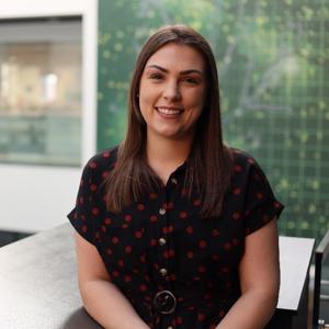
Rebecca Warnett
Senior Lecturer
I am a graduate Sports Therapist and the course leader for BSc Sports Therapy. Graduating in 2014 I have worked in women's football, ran my own sports injury clinic and have been lecturing at University of Staffordshire since 2015.
Rebecca's profile
Technical facility
Shows a summary card for the technical facility which links to the page about it. Technical facilities are those owned and maintained by the Technical Services team.
- Menu: SU Components (New) > Technical facility
- Location: /site/razor/template-components/card-facilities-technical.cshtml
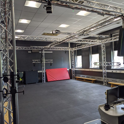
Motion Capture Stage
The Motion Capture Stage is an industry standard facility that provides training and sessions within Motion Capture, promoting innovation and realism within Animation practices.
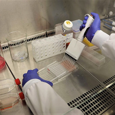
Cell Culture Facility
A specialist environment for the culture and study of both cancerous and non-cancerous human and mammalian cell lines.
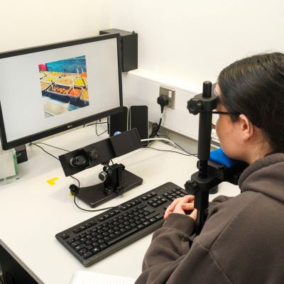
Psychology Eye Tracking Cubicles
Eye tracking allows us to track where people are focusing and paying attention visually, which can be useful to understand human behaviour across many areas of Psychology.
Testimonials
Shows either a set of multiple testominials or a single testimonial from the 'Testimonial features' entries.
- Menu: SU Components (New) > Testimonial
- Location: /site/razor/template-components/card-testimonials.cshtml
- Pattern library: https://staffsweb.github.io/staffs/design-system/components/detail/card--testimonial.html
I started looking around at what options were available in terms of universities and when I attended Staffs Open Day I felt comfortable and like I could fit in here. Since coming to the University, I can definitely say that I made the right choice, the teaching staff are so supportive and encouraging and they have definitely helped me get to where I am now. I was encouraged to try new things and to step out of my comfort zone with a placement year which took me to America! There is a huge sense of community within the University and I wouldn’t be where I am today without it.
Top 3 accolades
Shows accolades from accolade entries. Must use graphics provided by studio as PNGs and exported to SVG by web team.
- Menu: SU Components (New) > Top 3 accolades
- Location: /site/razor/template-components/top-3-accolades.cshtml
of Research Impact is ‘Outstanding’ or ‘Very Considerable’
Research Excellence Framework 2021
of Research is “Internationally Excellent” or “World Leading”
Research Excellence Framework 2021
UK University
to launch a computing degree in 1960s
Video embed (full width)
Used when you want to embed a video from entries full width in a container (not in a content card that opens the video in a modal).
- Menu: SU Components (New) > Video embed (full width)
- Location: /site/razor/template-components/video-fullwidth.cshtml
- Pattern library: N/A
Zebra
Used to provide alternating background blocks of content. Images used should all be the same size. These are mini-templates rather than controls inserted through the SU Components menu. You first need to drag and drop the 'zebra-wrapper', then drop the required number of 'zebra-row' templates within the wrapper.
- Location:
- /mini-templates/content-templates/zebra-wrapper
- /mini-templates/content-templates/zebra-row
- Pattern library: https://staffsweb.github.io/staffs/design-system/components/detail/zebra.html
Insert Content
Insert Content
Insert Content